The font, Artists LeWitt
Background
Making fonts has always been a mysterious field for me to explore, and I was so curious to try it out.
So in 2023, when I was designing a gallery and watchface app, this idea drove me to make a font and create the entire design with it. By today’s standards, it was pretty immature.
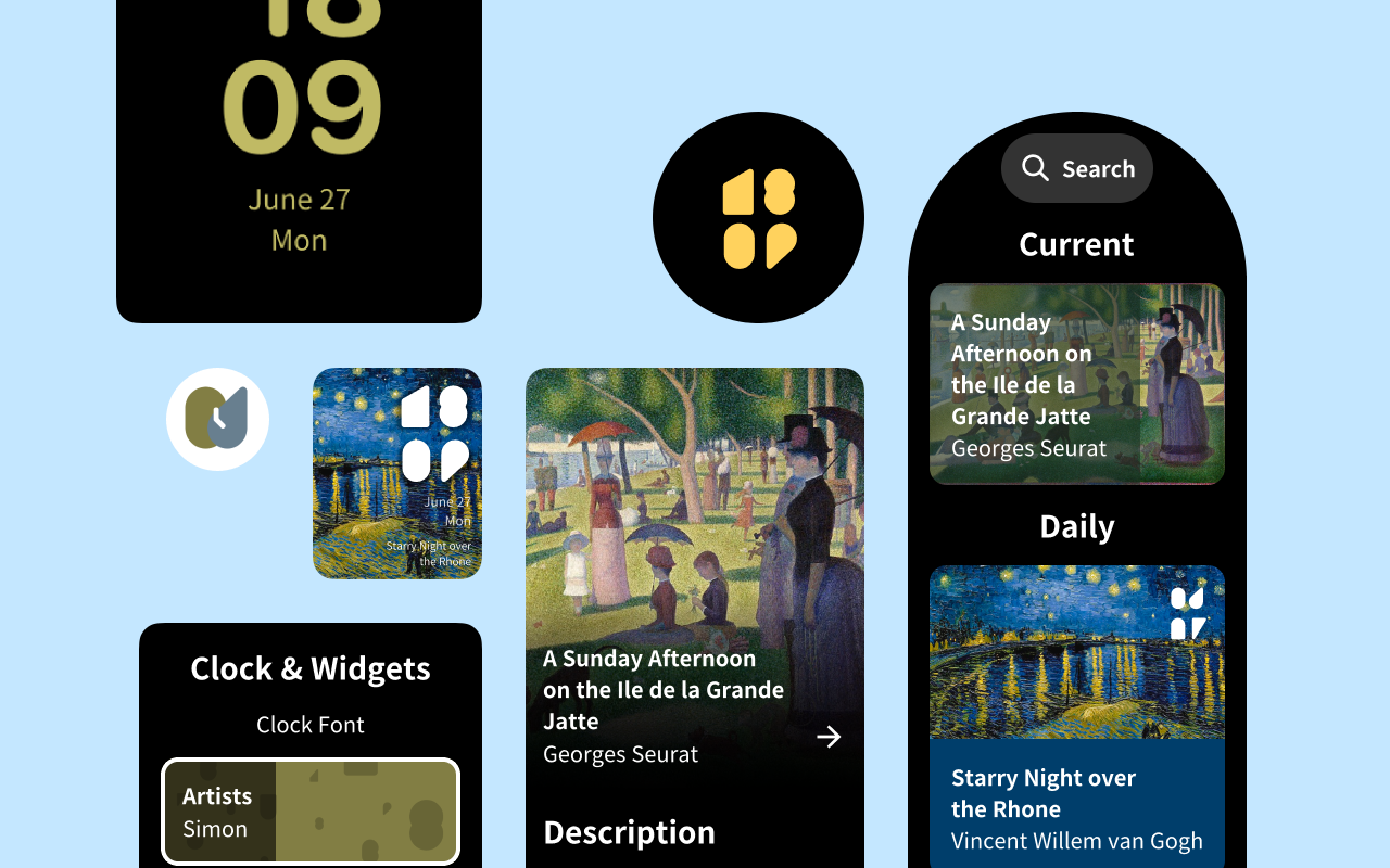
If you take a closer look at the sketches, you will find that this font is not even monospaced! But it does prove that fonts are critical for our designs, and it helped me understand how to conceive a design and bring it to life.
Unfortunately, I lost all the code and the font file many years later because I didn’t upload them to GitHub, keeping only the design file in the cloud (PS: YOU SHOULD NEVER LEARN THIS BAD HABIT).
But I do want to remake this font!
Reformat the shapes
I opened the design file. And found it’s kinda tricky to directly use these raw shapes.
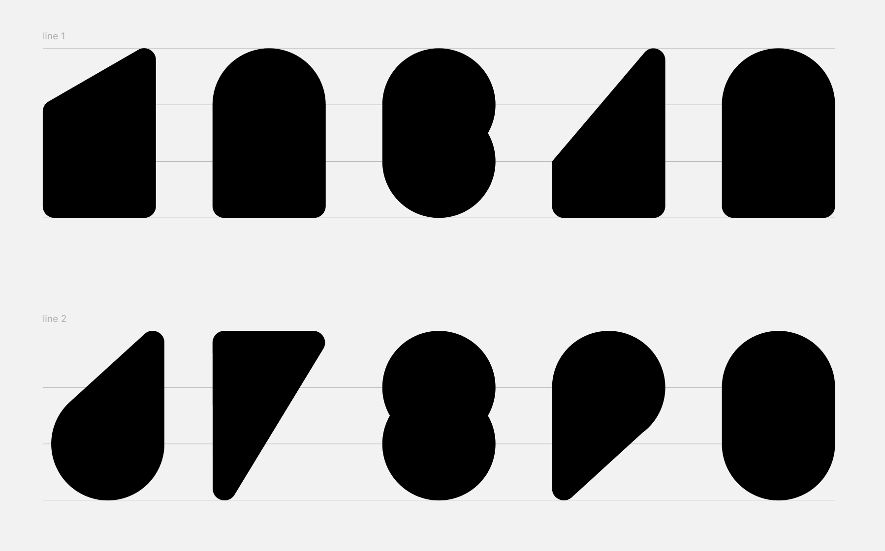
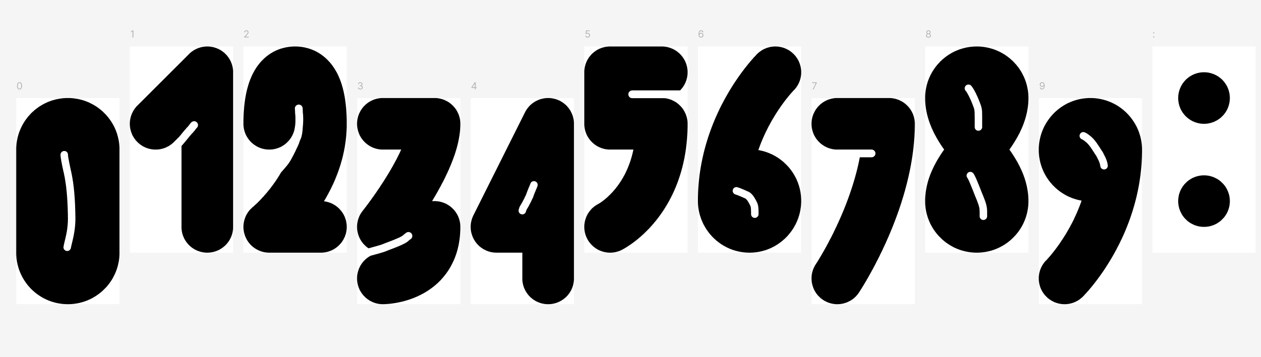
These shapes are just unions framed with four lines! Each of them was handcrafted and had bad metrics. I even forgot to polish a corner of the glyph 4.
So the first thing is to reformat these shapes. I want to keep the bold, immature, and wild design idea, so I still use a 2x3 grid for the numbers.
The first thing is to set up all the reference lines. Normally, a font will have a line height of 1000 units, with the baseline placed around 200 units above the bottom. This means the glyph does not simply live inside a visual canvas; it lives inside a coordinate system where the baseline, ascender, descender, and advance width all determine how the font behaves in real layouts.
For this font, I chose a 700 × 1000 design box. The glyphs themselves take 720 units in height, leaving enough vertical breathing room while still looking heavy and compact. I placed the glyph slightly above the baseline, from y=10 to y=730 in font coordinates. This keeps the numbers visually centered without making them feel like they are floating too high.
And now, draw these shapes!
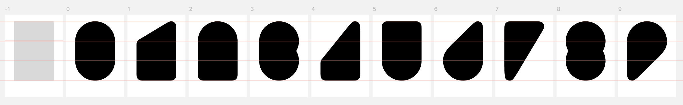
Simple, easy, and interesting. With the help of Figma, I finished it in 20 minutes.
And I want to talk about the glyphs 6 and 9. I drew the idea of composing this shape from rain drops. They are tiny, light, but delightful creatures among the world. So I let them lean on one side, and polished all of them carefully.
Make the actual font file
Ah, come to the worst part.
Last time I tried to make a font, I used FontLab manually. It was just like putting an idiot in an aircraft cockpit and letting him fly the plane! Both the result and the process were terrible for me.
So I wanted to figure out whether there was any way to create a font without touching these sophisticated tools. And the answer is YES.
Thanks to FontForge, we can create a font with Python and SVG. Here is the key code.
import os
import fontforge

# 1. Font Metadata & Metrics Setup
font = fontforge.font()
font.familyname = "Artists"
font.fontname = "Artists LeWitt"
font.fullname = "Artists LeWitt"

font.em = 1000
font.ascent = 810
font.descent = 190

# Ensure modern software uses typo metrics for consistent line spacing
font.os2_typoascent = 810
font.os2_typodescent = -190
font.os2_tyolinegap = 0
font.os2_use_typo_metrics = True

# 2. Import SVGs & Process Glyphs
for i in range(10):
    char = str(i)
    svg_path = os.path.join("./LeWitt", f"{char}.svg")
    if os.path.exists(svg_path):
        # Create glyph by Unicode codepoint and import SVG vector
        glyph = font.createChar(ord(char), char)
        glyph.importOutlines(svg_path)

        # Clean up vector paths and set advance width
        glyph.correctDirection()
        glyph.removeOverlap()
        glyph.round()
        glyph.width = 700

# 3. Export Font Files
font.generate("LeWitt.otf", flags=("opentype",))
font.generate("LeWitt.ttf", flags=("opentype",))
Export the SVGs, install FontForge, and run ffpython build_font.py. Everything is done! Now I can type with this font.
Name it boldly
But wait… How should I name this font? Its original name is just “Artist” because of the bold geometric shapes. But I did get some other inspiration for this font. So maybe I could set the font family name to “Artists” and use the names of famous artists? That’s a good idea!
And well done after talking with Gemini, the name is Artists LeWitt. Sol LeWitt once wrote, “The idea becomes a machine that makes the art.”
When I was renaming this font, this exact quote echoed in my mind. This font didn’t start with professional bézier curves or meticulous typography theories; it started with a pure, raw concept: How can I build a bold, heavy visual identity entirely constrained within a strict 2x3 grid?
By naming it Artists LeWitt, I wanted to pay tribute to that philosophy. The python script is the renderer, the grid is the rule, and the initial spark from years ago is the machine. I’m glad this machine is running again.
Another idea
I also got another idea and drew it. The glyphs look heavily padded, almost like helium-filled balloons or bold street graffiti, giving off a strong Pop Art energy.
So how can I name this font?